Get In Touch
3080 Tamiami Trail E. Ste. 301 Naples, FL 34112
hello@mycollectiveagency.com
Ph: +239.319.4851
Work Inquiries
hello@mycollectiveagency.com
Ph: +239.319.4851

Magnanimous Brewing

  • Client

    Magnanimous Brewing

  • Dates

    2018-2019

  • Category

    Branding

Big beards. Good beer. A generous spirit.

Logo & Branding

“Magnanimous people have no vanity, they have no jealousy, and they feed on the true and the solid wherever they find it. And, what is more, they find it everywhere.”

– Van Wyck Brooks

A brand identity rooted in the people and purpose behind Magnanimous Brewing.

About the Client

After more than 20 years immersed in the beer industry, Charlie and Mike were ready to build something of their own.

Magnanimous Brewing brought together their love of making beer, their enthusiasm for wrestling, and a shared belief in treating people well. These were two big, burly, bearded guys with a generous spirit. Their brand needed to feel just as personal.

The Challenge

How do you capture serious beer knowledge, a love of wrestling, and genuine kindness in one identity?

For their original launch, Charlie and Mike needed a brand that could introduce the brewery and give people a sense of the owners behind it. It needed character, a clear point of view, and the flexibility to work across everything from a small logo placement to brewery signage.

Unveiling our
captivating
color palette.

Warm yellow nods to golden pours and a generous spirit. Deep navy brings a sturdy, grounded feel, while gray takes its cue from the steel tanks behind the beer. Together, they create a palette that feels hardworking, welcoming, and full of character. Just like the people behind Magnanimous.

Primary Color

Blue Collar

HEX: #2c486d

Primary Color

Malt Gold

HEX: #d8c766

Primary Color

Steele Keg

HEX: #6d6e71

The Solution

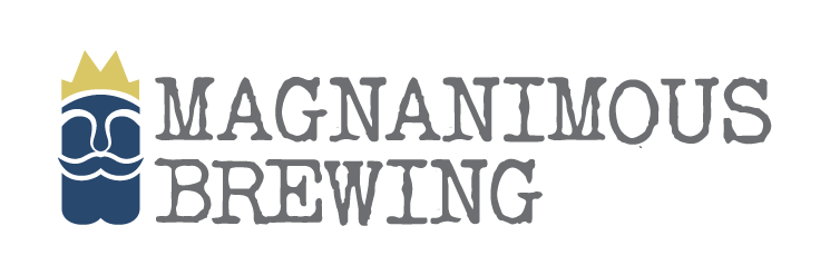
We started with the idea at the heart of the name: being magnanimous. Generosity, kindness, and chivalry gave the brand its foundation, while the owners’ personalities gave it a face. Literally.

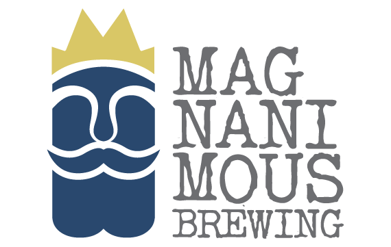
The crowned, bearded character brings those influences together. The crown nods to chivalry. The beard is a personal reference to Charlie and Mike, making the mark unmistakably connected to its founders.

Silk Remington’s textured lettering adds a familiar, slightly scrappy character. Navy, yellow, and gray give the identity a confident palette, with enough warmth to keep it welcoming.

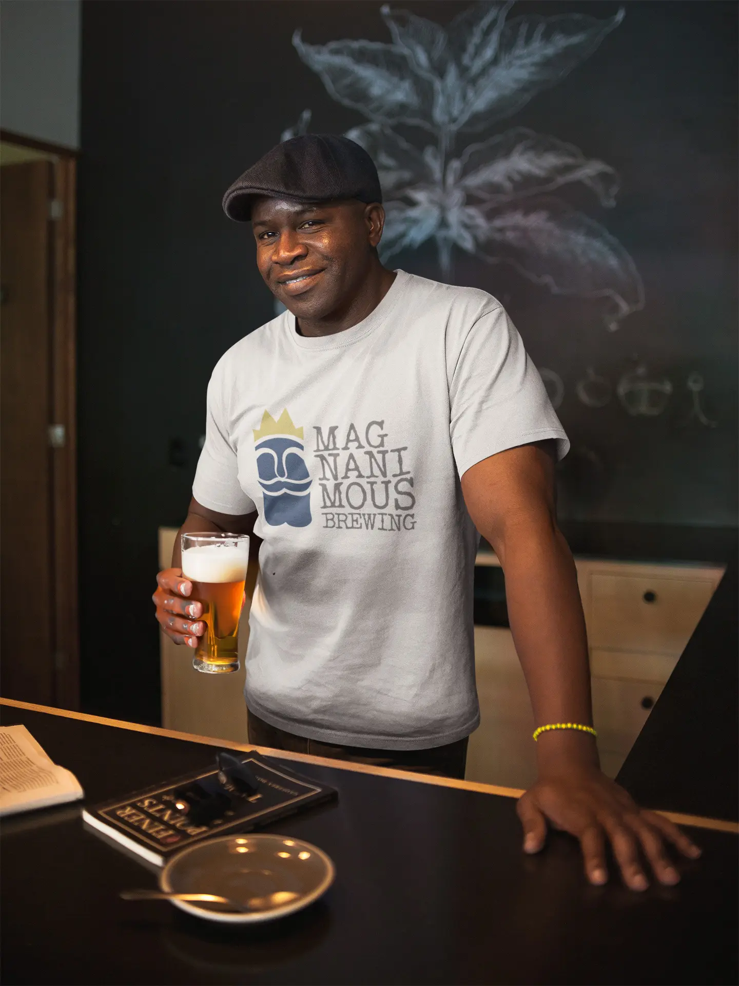
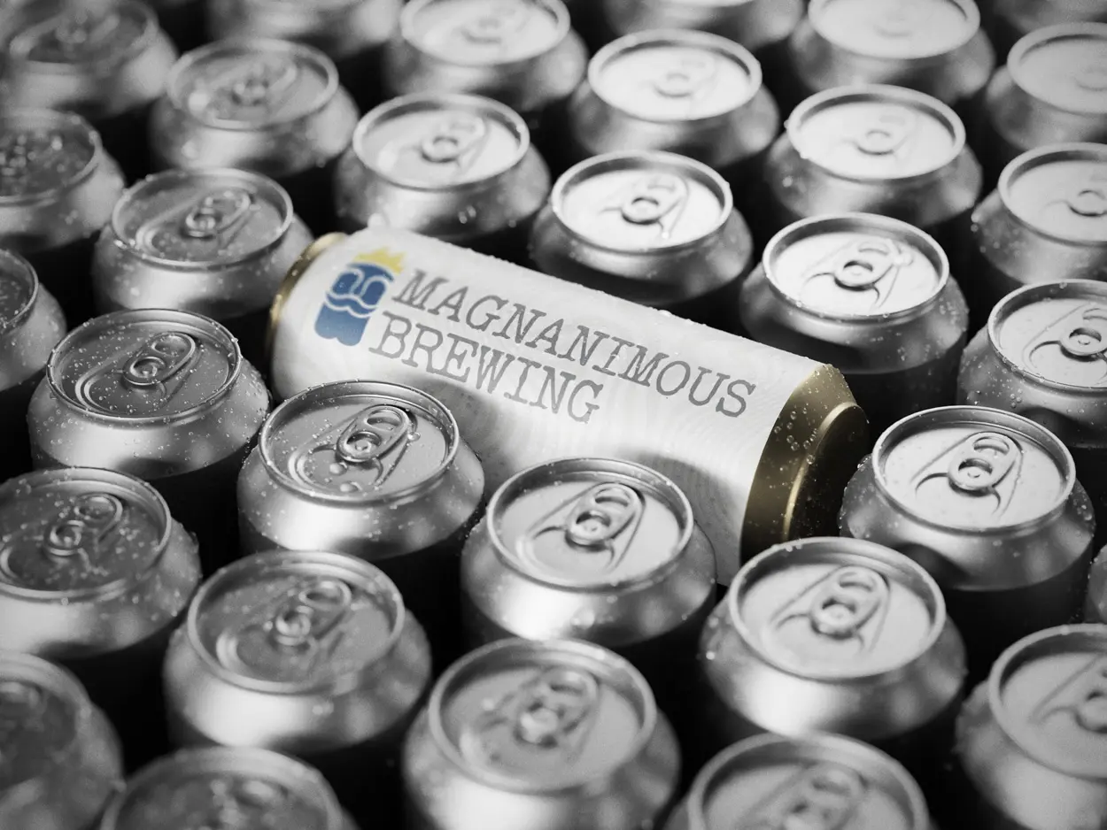
We developed three logo lockups to give the brewery flexibility across different spaces and formats, then carried the identity into signage for the launch.

The Result

The identity received great feedback and remains in use today.

What began as a launch project gave Magnanimous a lasting visual signature: a crowned, bearded character rooted in its founders and the values they brought to the brewery.

Beer expertise. A generous welcome. A little wrestling spirit. A brand that feels like Charlie and Mike.

Key Features

  • • Brand strategy grounded in the founders’ personalities and values

  • • Custom crowned, bearded logo character

  • • Three adaptable logo lockups

  • • Navy, yellow, and gray color palette

  • • Silk Remington typography

  • • Brewery signage

Back

This website stores cookies on your computer. Cookie Policy

Secret Link