Get In Touch
3080 Tamiami Trail E. Ste. 301 Naples, FL 34112
hello@mycollectiveagency.com
Ph: +239.319.4851
Work Inquiries
hello@mycollectiveagency.com
Ph: +239.319.4851

Irene’s Gourmet Sweets

  • Client

    Irene's Gourmet Sweets

  • Dates

    2020

  • Category

    Branding

A little nostalgia. A lot of homemade love.

Logo & Branding

A small-batch confectionery based in Chicago. Named in her grandmother’s honor.

About the Client

For Lisa, the best part of holiday baking was helping her grandmother, Irene, make sweet treats for the community. It was the anticipation, the time together, and the joy of sharing something homemade.

Those memories became the inspiration for Irene’s Gourmet Sweets, a small-batch confectionery based in Chicago. Named in her grandmother’s honor, the business gave Lisa a way to share that feeling with her neighborhood and, eventually, customers across the country.

The Challenge

Lisa needed an identity for her original launch that felt as personal as the story behind it.

The goal was to capture the delight of a homemade delivery: something your grandmother wrapped up for you or a friend from church left at your door. As the business grew beyond friends and family into an online shop, the branding needed to carry that warmth to people who hadn’t met Lisa yet.

The Solution

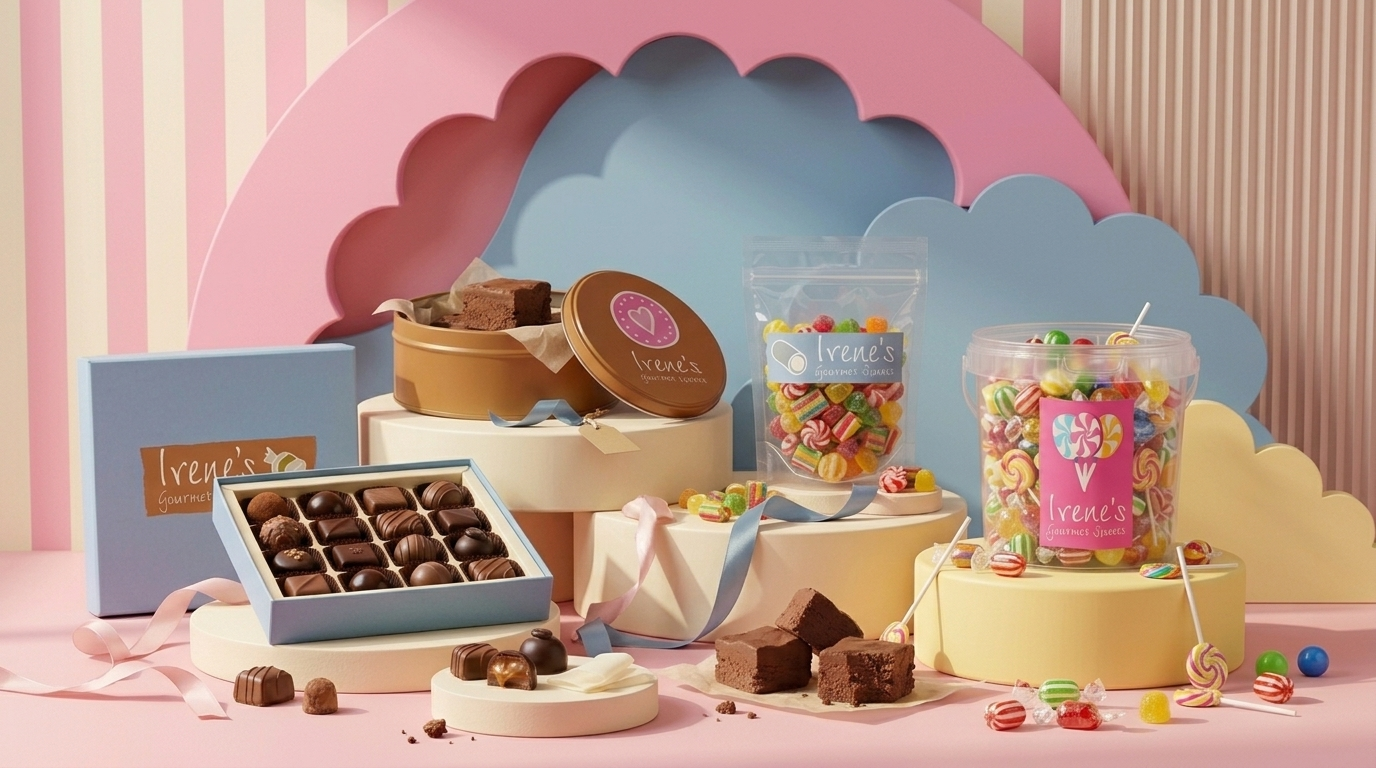
We built the brand around a sense of old-timey fun, pairing handwritten lettering with cheerful colors and illustrations of sweet treats.

The loose shapes and imperfect edges give the identity a handmade quality. Each variation feels like part of the same little candy shop, with different confections bringing their own personality to the collection.

That playful approach carried through to the packaging and labels, helping every order feel like a thoughtful gift. Whether it traveled across Chicago or across the country, the presentation brought a little of Irene’s kitchen along with it.

The Result

Lisa loved the finished identity. The brand gave her a personal, joyful way to introduce the business and honor the grandmother who inspired it.

From the logo to the labels, every piece helped tell the same story: sweet treats made with care, meant to be shared.

Key Features

  • Brand strategy inspired by family memories and community

  • Handwritten lettering and illustrated sweets

  • A colorful collection of coordinating logo variations

  • Packaging and labels that extended the homemade feel

Back

This website stores cookies on your computer. Cookie Policy

Secret Link