

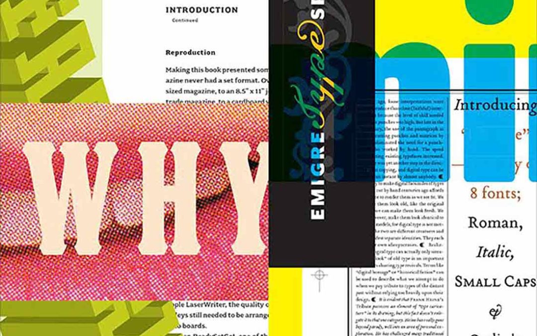
I remember doing a huge paper on Emigre in design school…their font books dazzled me and made me want to do what I’m doing today! Check out this article on Emigre and the 90’s from AIGA.
New Emigre Fonts book on how these designers tapped into the digital zeitgeist
I was working at my first grownup-girl art director job when Northern California type foundry Emigre started selling fonts, and it was truly a big deal to pluck the latest issue of their beautifully printed catalog from my IRL inbox, order a floppy disk, install both the screen and the printer fonts, and get to work. Using Emigre fonts in a layout was the typographic equivalent of sitting with the cool kids. The fonts became so popular, that for a stretch of the ’90s it was practically impossible to open a magazine without finding the intricate repeating patterns of Emigre’s Whirligig characters.